Well, some things just need a little explaining, eh?
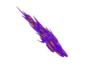
The Logo depicts our version of stylised roots—you know, tree roots—just like our site tag says, Returning to our Christian Roots—although with a difference. Let me ‘splain.
These roots are of a spiritual nature. The type of roots I am referring to grow right back to the very beginning, right back to the root of where all this began…and possibly back even a little further than that. Now using a little sanctified imagery, the logo is an attempt to take our thoughts beyond what is simply just seen. Moving back past the tip of the Tap Root, and even further, right back before time and creation into exploring and revealing the original reason God made all things, seen and unseen, in Heaven and in earth. Even including us and all of You-manity!
The roots are simply motioning along a path to return to the original thought conceived in the divine counsels of the Godhead. So, rather than growing downwards, which is something familiar to us, something we would take for granted and have no trouble understanding, these roots are heading in a counterintuitive, illogical direction. They are moving upward and backwards. Isa 55:8 “For My thoughts are not your thoughts, nor are your ways My ways,” declares the LORD.
The next thing you may notice is the colours, not your typical tree root colours, right? Now, the colours typify the origin from where and from whom these roots came. For example, Purple in the scriptures represents the Royalty and Kingship of God, and so the origins of all things flow from His sovereignty, authority, majesty and power.
We see from scripture that purple was commonly associated with articles used in the construction of the tabernacle and the temple. Exodus 26:1 states, “Moreover you shall make the tabernacle with ten curtains of fine woven linen and blue, purple, and scarlet thread; with artistic designs of cherubim you shall weave them.” So purple found its place on things like the outer curtains of the temple. So the outer bark of the roots in our logo is shown in purple.
Amber has been known to originate from very old, even ancient trees! It has various hues, some of which are yellowish-orange in colour. This colour in scripture represents the Glory of God and the Presence of God, which most often was manifested in the hidden inner room of the Tabernacle, in the Holy of Holies. So, in our logo, the colour amber inside of the purple roots represents His ultimate self-expression – His Presence and His Glory. As mentioned in Isaiah 55 above, His ways run quite unparalleled to ours. So by going back to the roots, and possibly beyond, we start at the start. We look to discover the original heartbeat of God for everything, which is revealed in a way He ultimately intended and wants to be known.
In our journey we are coming to understand that this ultimate intention has been majorly lost in what we altogether call ‘Christian’. So the logo represents the purpose of the website and our podcast, which is to explore the ultimate intention of God.
Just before we go–God so often reveals aspects of Himself in what He has created, and so, therefore, funnily enough, creation/nature often reveals what our minds can’t imagine. A good example of the above explanation of our logo is found in the humble carrot. Did you know that the carrot is essentially a large overgrown Tap Root? Also, the carrot has a number of different colours. Obviously, the most common ones are orange – or amber. The other colour less commonly known and yet the original colour, is purple. Then you get the one that is purple on the outside and orange in the middle. There you go…:-)

 These roots are of a spiritual nature. The type of roots I am referring to grow right back to the very beginning, right back to the root of where all this began…and possibly back even a little further than that. Now using a little sanctified imagery, the logo is an attempt to take our thoughts beyond what is simply just seen. Moving back past the tip of the Tap Root, and even further, right back before time and creation into exploring and revealing the original reason God made all things, seen and unseen, in Heaven and in earth. Even including us and all of You-manity!